Slay the Word Doc
Replacing a scattered Word-doc trail with one guided authoring flow, so managers across a 1M+ employee org write level expectations that hold up in calibration.
01 Situation
Situation
An AI-assisted authoring tool that gave Amazon managers one place to write, compare, and defend level expectations.
Role: UX Design Intern the only designer on the project, working with a product manager, senior UX leads, and HR business partners
Company: Amazon · Global Talent Management & Compensation (GTMC) an internal team that builds research-backed tools for hiring, promotion, and performance decisions, reaching a global workforce of more than 1 million employees
Duration: 3 months (12 weeks) in Summer 2022
Tools: Figma with internal plug-ins · FigJam · Amazon Chime · Slack
Scope: Internal HR web application · levels L4–L7 · 3 personas · 30+ user stories · 200+ high-fidelity screens · 4 design cycles
Status: The tool had not shipped when my internship ended.
The Problem
Every job at Amazon carries level-specific expectations from L4 to L7, but those expectations were scattered across Word docs, out-of-date wiki pages, and email threads, with no authoritative version.
The Goal
My goal was to design an internal, step-by-step authoring tool the Role Guidelines Builder where managers and role authors write expectations, compare them across levels, and feel confident the bar is clear. Two features carry it: Get Suggestion, which drafts level-specific language, and Calibrate, which compares all four levels and uses no AI at all.
Review conversations turned subjective, leveling disputes surfaced in calibration, and managers hunting for the “right” document often found that two adjacent levels described the same work in nearly the same words. That last part reframed the project for me. This was not a storage problem, so better search would not have fixed it the content itself was broken, and the blank Word doc that produced it gave authors no way to see the problem they were creating.
Two levels often described the same work in nearly the same words.
02 Tasks
Tasks
My role & responsibilities
UX Design Intern the only designer on the project. I was not working alone: a product manager owned requirements, and senior UX leads and HR business partners reviewed every design cycle.
I owned the design work end to end: stakeholder interviews, a content audit, turning user stories into journey maps, information architecture, 200+ high-fidelity screens, and a full handover package for the team that would build it.
What I delivered
The handover package came to five artifacts.
- 12–15 stakeholder interviews across three roles, plus synthesis
- 3 journey maps, one per persona SME writer, program owner, HR business partner
- 200+ high-fidelity Figma screens built with Amazon design tokens
- 15 annotated, clickable prototypes
1 usability testing plan for the next team to run
Figma with internal plug-ins · FigJam · Amazon Chime (video conferencing) · Slack
03 Actions
Actions
Phase 1: Discovery & Research
I started with the people stuck inside the current process, then went looking for the documents they were stuck with.
Output 01
Stakeholder interviews
I ran structured interviews with 4–5 key people across three primary roles: active role authors, product managers, and HR business partners. The goal was to learn how the manual process actually worked day to day, where it broke down, and what people were trying to accomplish.
Output 02
Document & wiki audit
I pulled together 55+ old role guidelines, 77 offline draft folders, and 100 half-finished wiki templates from across teams. That surfaced the formatting mistakes, the levels that overlapped, and just as usefully what a genuinely good guideline looked like.
Output 03
Journey maps for 3 personas
I turned a business requirements document with 30+ user stories into journey maps for three groups: subject-matter-expert writers, program owners, and HR business partners. That showed where each group hit friction, then lined all three up behind one shared authoring flow.
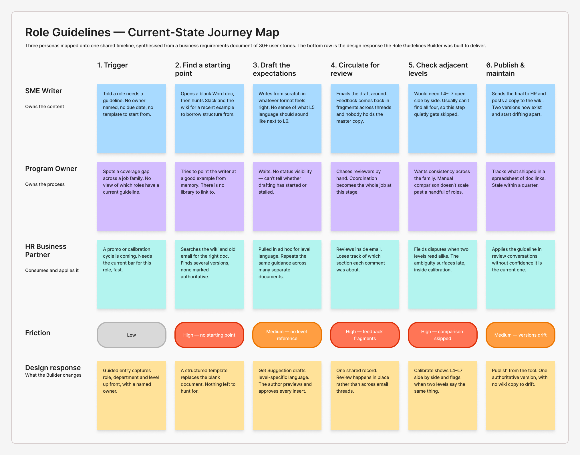
Journey map reconstructed from the original Amazon synthesis. Three personas on one timeline; friction peaks where authors had no starting point, no way to compare levels, and no single copy to review.
Phase 2: Define & Strategy
Research hands you a pile of insights. The harder part is deciding what to build and what to leave alone.
Output 01
Three “How Might We” questions
I wrote three tight prompts to work against. They turned loose research findings into firm constraints, so the project didn’t balloon into everything at once.
HMW 01
Replace scattered docs with one guided flow.
HMW 02
Use secure AI suggestions to speed up writing.
HMW 03
Build a comparison tool that uses no AI at all.
Output 02
Design principles
I set three principles to give design reviews a shared standard. When a debate came up, we could point at a principle instead of trading opinions.
- Transparency: authors can see what the tool is doing and why.
- Flexibility: the flow adapts to different job families.
- Guidance: a first-time author is never left staring at a blank page.
Phase 3: Systems Design & Architecture
Output 01
Linear authoring flow
I folded 30+ scattered user stories into one step-by-step writing flow that replaced the open Word doc with a guided form. It worked out how role information should move through the tool and land in the author’s workspace, so the content had a clear order before I drew a single screen.
Output 02
Design token strategy
I audited Amazon’s internal design tokens type scale, spacing grid, form fields and built my layouts on top of them. That kept the designs buildable: engineers could use pieces they already had instead of making new ones from scratch.
Phase 4: Prototyping & Proving It Could Work
Two features carried the concept. One used AI. The other very deliberately did not.
“Get Suggestion” The AI part
I designed a suggestions panel that drafts level-specific guideline language, revealing a step at a time instead of all at once. It gets a first-time author unstuck fast while requiring them to preview and approve every suggestion before it lands in the doc.
AI does the legwork; the human stays in command.
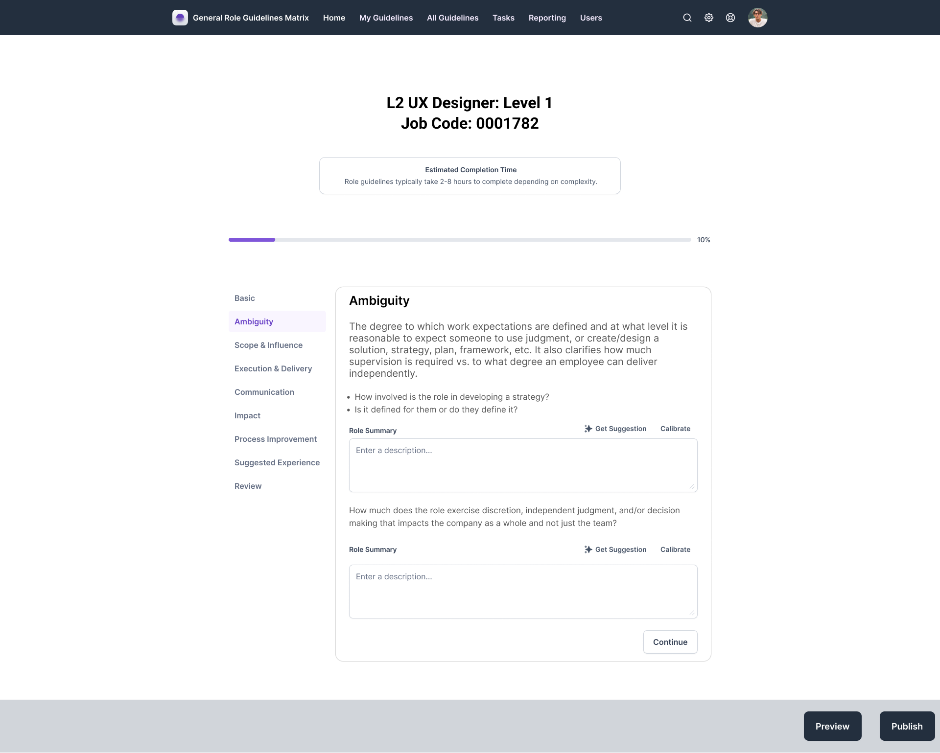
Get Suggestion sits collapsed beside every Role Summary field. The author’s own writing surface is the default state; assistance stays dormant until it is asked for.
“Calibrate” no AI
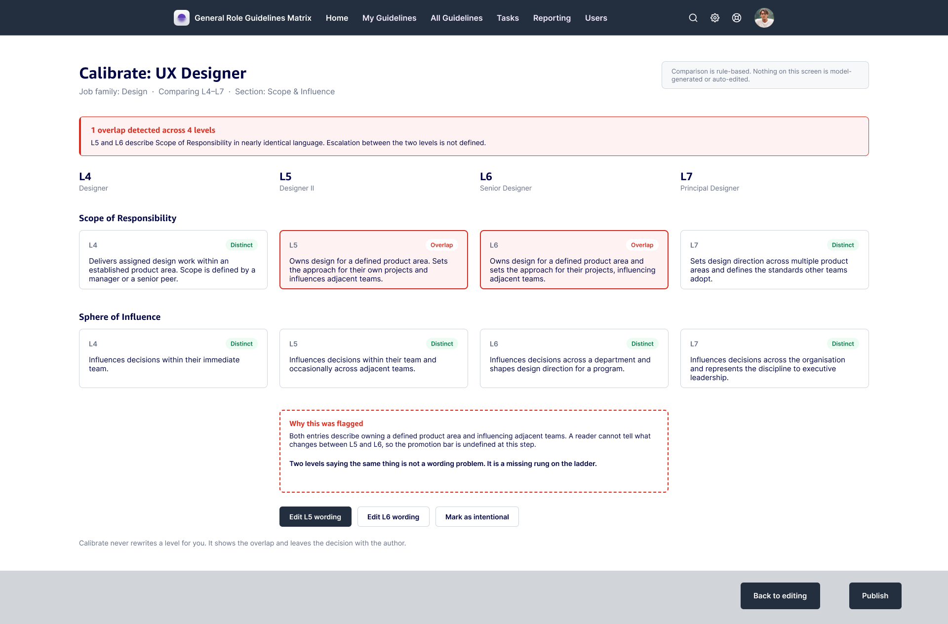
I designed a side-by-side view showing L4, L5, L6, and L7 at the same time, with automatic alerts when two levels said nearly the same thing. There was a reasonable argument for extending the AI here have the model read all four levels and propose the differentiating language itself. I argued against it. Calibration is where fairness gets decided, and if a model proposes the distinction between an L5 and an L6, the org inherits a boundary nobody can fully explain and the person on the wrong side of it has no one to ask. Detection is mechanical, so I automated it. Judgment is accountable, so I left it with the humans who have to defend the outcome.
Four levels on one screen. When L5 and L6 describe the same scope, Calibrate flags the pair and hands the decision back to the author — no model involved.
200+ high-fidelity screens
I built 200+ annotated screens across four full design cycles, including the states each screen needed at different sizes handing engineering and product a design foundation they could build from, not just a concept to admire.
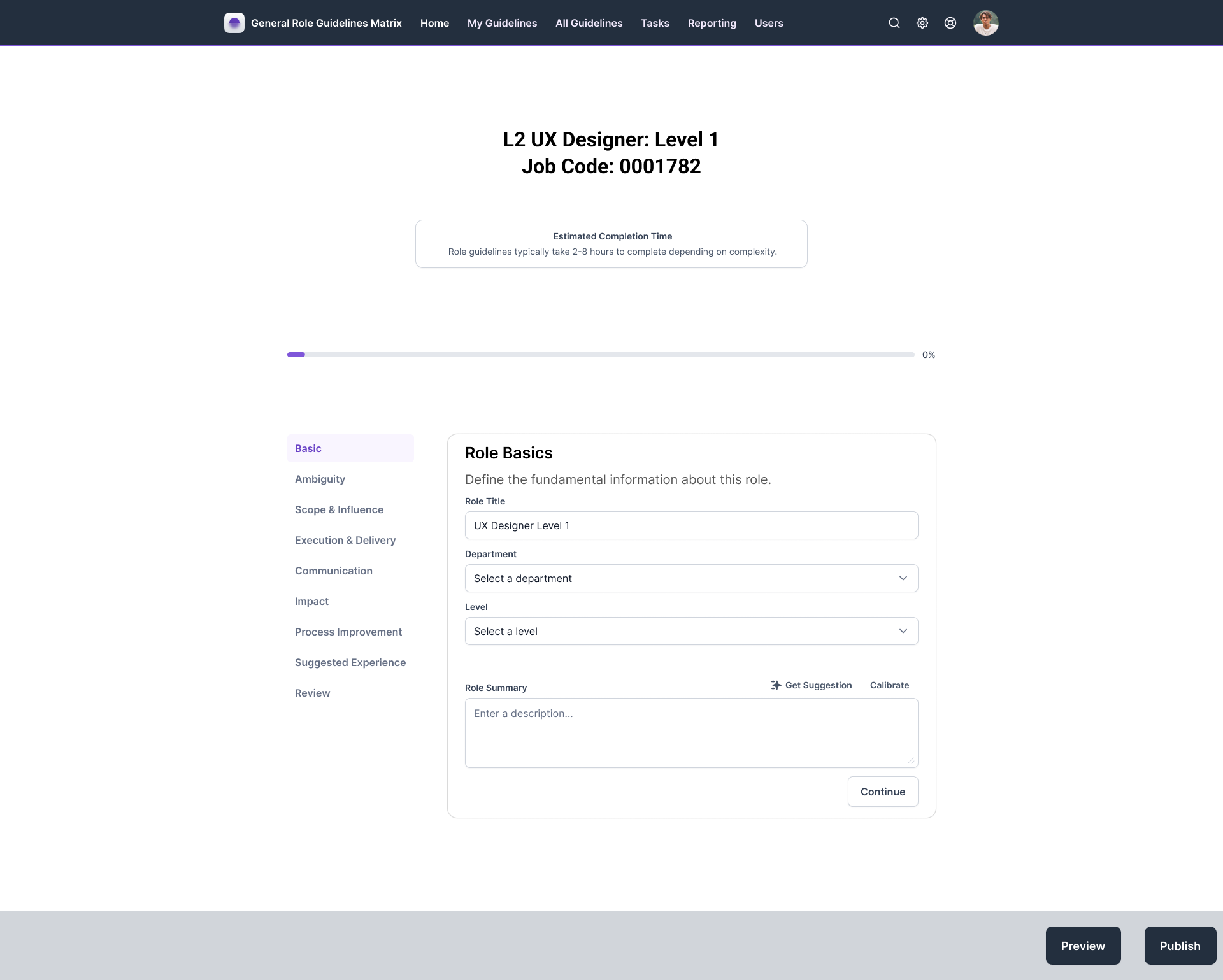
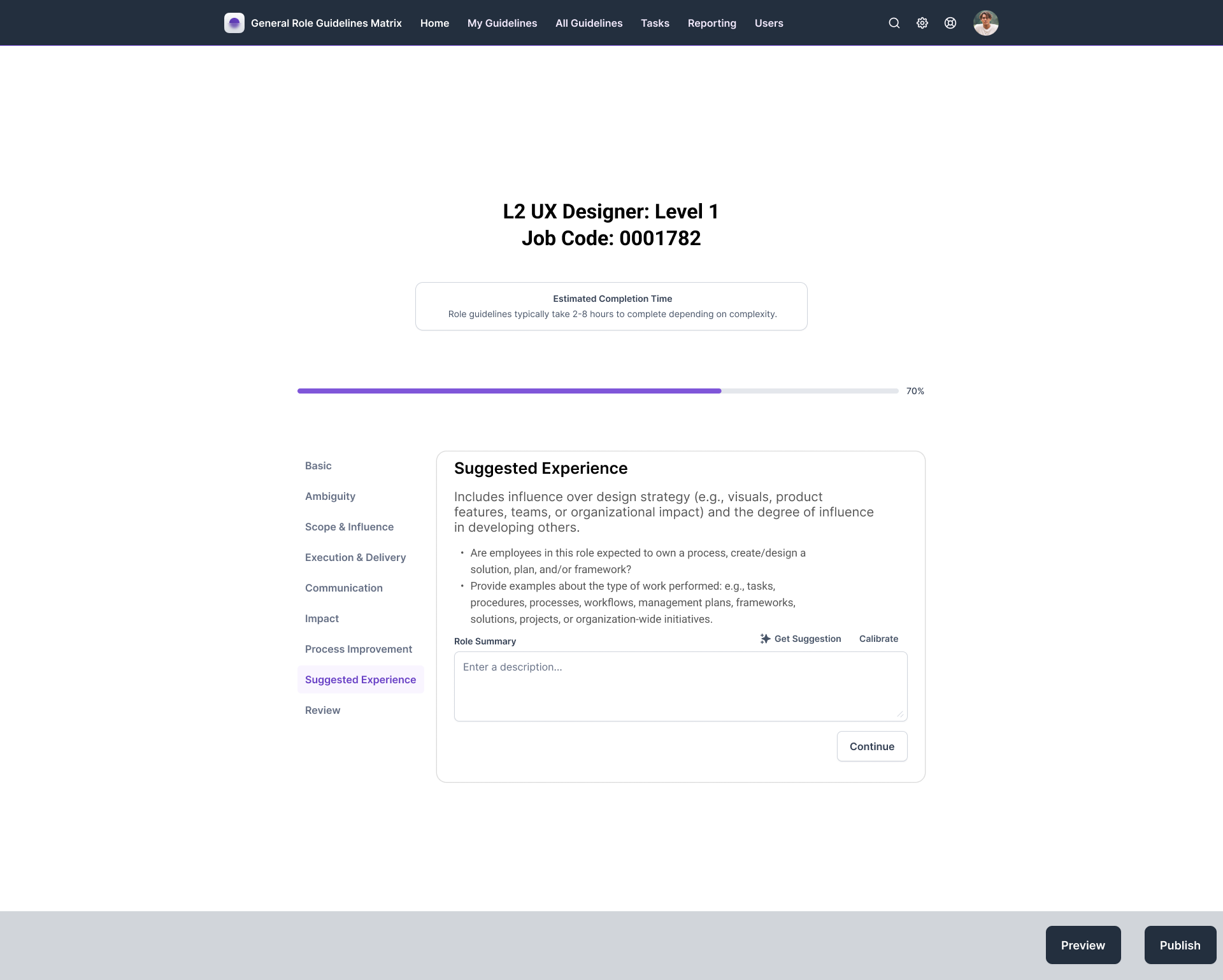
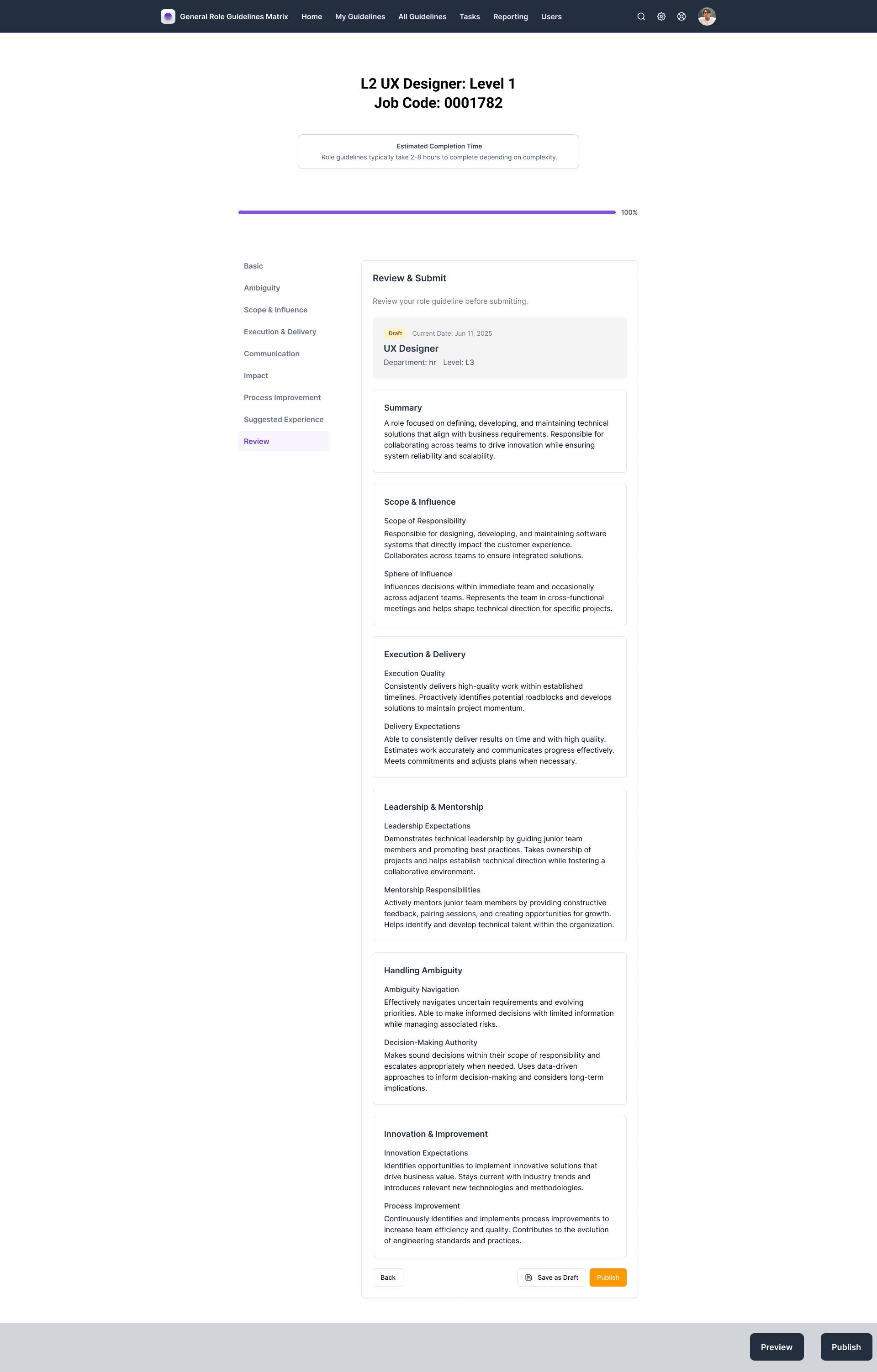
Four design cycles, 200+ annotated screens. The guided flow at 0%, 70%, and 100% an empty Role Basics form, AI-assisted drafting, and the assembled guideline ready to publish.
200+
annotated hi-fi screens
30+
user stories mapped to flow
3
personas served by one spine
4
full design cycles in 12 weeks
04 Actions · Phase 5
Phase 5: Testing & Iteration
Losing moderated testing was the biggest constraint on the project, so I built a substitute rather than skipping feedback. Async expert review cost me the ability to watch people struggle in real time, but it bought three rounds of feedback I would otherwise not have gotten at all and it reshaped the tool three separate times.
Output 01
Async design reviews
I used Slack and Chime to run unmoderated reviews with senior UX leads and HR partners on their own schedule. That pressure-tested the screens and caught gaps between levels without waiting on everyone’s calendar.
Output 02
Iteration 1: Modular job families
I broke the single rigid path into content blocks authors could turn on and off. A senior UX lead pointed out that a technical role and an operations role don’t need the same fields. One fixed path would have failed both.
Output 03
Iteration 2: AI moved into a drawer
I pulled AI suggestions out of inline auto-fill cards and into an on-demand side drawer with clear Insert, Regenerate, and Edit buttons. Writers told me they were nervous the AI would overwrite work they’d already done. Suggestions now wait until asked, and nothing enters the document without a click.
Output 04
Iteration 3: Tone controls
I added toggles to the suggestions panel for Technical, Operational, and Executive phrasing. A product manager noted that the same expectation reads differently to an engineer than it does to a VP. Authors needed control over the voice.
05 Results
Results
What shipped from my 12 weeks
Measured · delivered
- A production-ready design foundation 200+ annotated screens, annotated clickable prototypes, and a documented component approach built on Amazon’s own design tokens. This became the official UX blueprint and priority order for the Role Guidelines Builder MVP.
- A shared understanding of the problem interview synthesis, a content audit, and three journey maps that gave the team one agreed-on picture of where the manual process was failing and who it was failing.
- 15 annotated, clickable prototypes plus a usability testing plan for the next team to run
What the design was built to do (projected)
Projected · not measured
Projected 01
Give back administrative hours
Replacing email chains and scattered Word docs with one guided flow removes most of the coordination tax on Amazon’s manager and HR network.
Projected 02
Reduce leveling bias
Standardizing L4–L7 expectations, retiring stale guidelines, and surfacing duplicate language should cut down on disputes during authoring the moment when unclear wording does the most damage.
Those two outcomes are projected, not measured. The tool had not shipped when my 12-week internship ended, so there is no post-launch data to report.
Next steps
Hand the annotated Figma prototypes to engineering for MVP development, then run the usability testing plan moderated sessions with 10–12 active Amazon managers to validate the screen layouts against real drafting work.
Future considerations
With more time, I’d design a Calibration Session Facilitator Mode: a shared split-screen view a calibration leader could open during a live meeting, so a room full of managers could compare levels, edit criteria, and vote in real time instead of talking past a document.
Lessons learned
This internship taught me to run research on my own and to think in systems rather than screens. At Amazon’s scale the interface is the smallest part of the problem. The real work is understanding how the organization actually operates, translating technical limits into something that feels simple, and showing your reasoning clearly enough that stakeholders can follow it and push back on it. The decision I am proudest of is the one where I chose not to use AI knowing where a model helps and where it quietly removes accountability is the judgment call I expect to keep making.