The Gift of AI Help, Not Homework
How I redesigned digital AI gifting to hand people a present instead of a setup task targeting a 125% lift in checkout conversion.
Situation & Task
Most digital gift cards are built for one store. You buy a Starbucks card, the person taps it at the counter, and it works. Done.
Gifting AI tools doesn’t work that way. The person opens your gift and immediately has a to-do list: create a developer account, decode a pricing page written in “API credits,” and hand over their own billing information before anything happens.
That’s not a gift. That’s an assignment.
I started calling it the “homework” problem, and it turned out to be the whole reason people don’t gift AI in the first place. Buyers want to share what AI can do; they hold back because they don’t want to stick a non-technical friend or parent with an hour of setup. The opening was a two-sided store where anyone can buy, customize, and send AI credits from multiple providers in under 60 seconds, with nothing left for the recipient to configure. Nobody had claimed that market.
Snapshot
Traditional gift cards are built for a single merchant. They can’t carry token allocations across ChatGPT, Claude, and Midjourney so gifting AI means handing someone a chore: developer accounts, opaque API credit pricing, and a billing form standing between them and any value at all.
How might we build a store where a non-technical person can buy, personalize, and send AI credits in under 60 seconds without handing the recipient any homework?
Phase 1: Discovery & Research
The sentence that became the thesis
“I want to give someone the gift of AI help, not homework.”
Sarah, 34, research participant
That one sentence became the product thesis.
Before I could fix the gifting experience, I needed to hear where it actually fell apart. Three outputs came out of discovery.
User interviews
I ran one-on-one interviews with five people who regularly buy or receive digital gifts, walking through their real checkout experiences looking for the moments where people get nervous or give up, the drop-off points hiding inside a normal checkout.
Persona: Sarah, 34.
I pulled the findings into one representative buyer: someone excited to share new technology but worried about the hassle she’s passing along. It kept the work aimed at a specific person instead of a faceless “user.”
7-phase journey map.
I mapped the experience end to end: Need → Search → Find → Personalize → Purchase → Send → Redeem, charting buyer emotion and expectations at every step. It showed where the effort piled up — clustered in two places, finding the right option and getting through checkout.
Then there's the category problem. Traditional digital gift cards are single-brand, subscription-shaped, and quietly assume the recipient will do the setup. Multi-provider token allocation simply doesn't exist every AI tool locks its credits inside its own ecosystem.
There is no single place built to give someone “AI help.” The tools own the credits; nobody owns the gifting moment. That’s an untapped e-commerce category waiting for a checkout flow.
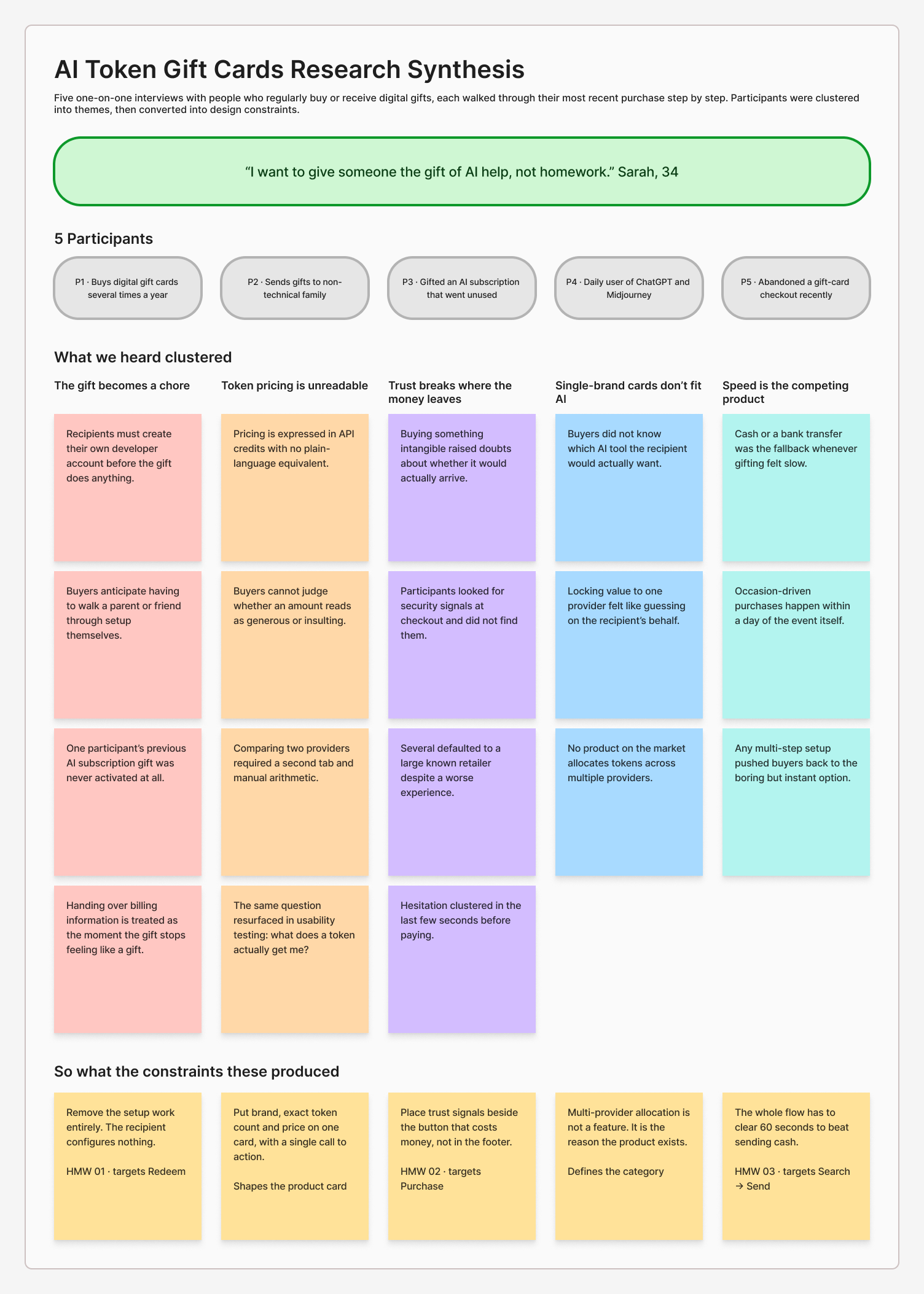
Caption: Affinity synthesis across five interviews. Each theme resolves into a design constraint, three of which became the How Might We prompts.
Highlighted phases are where abandonment risk and cognitive friction spike.
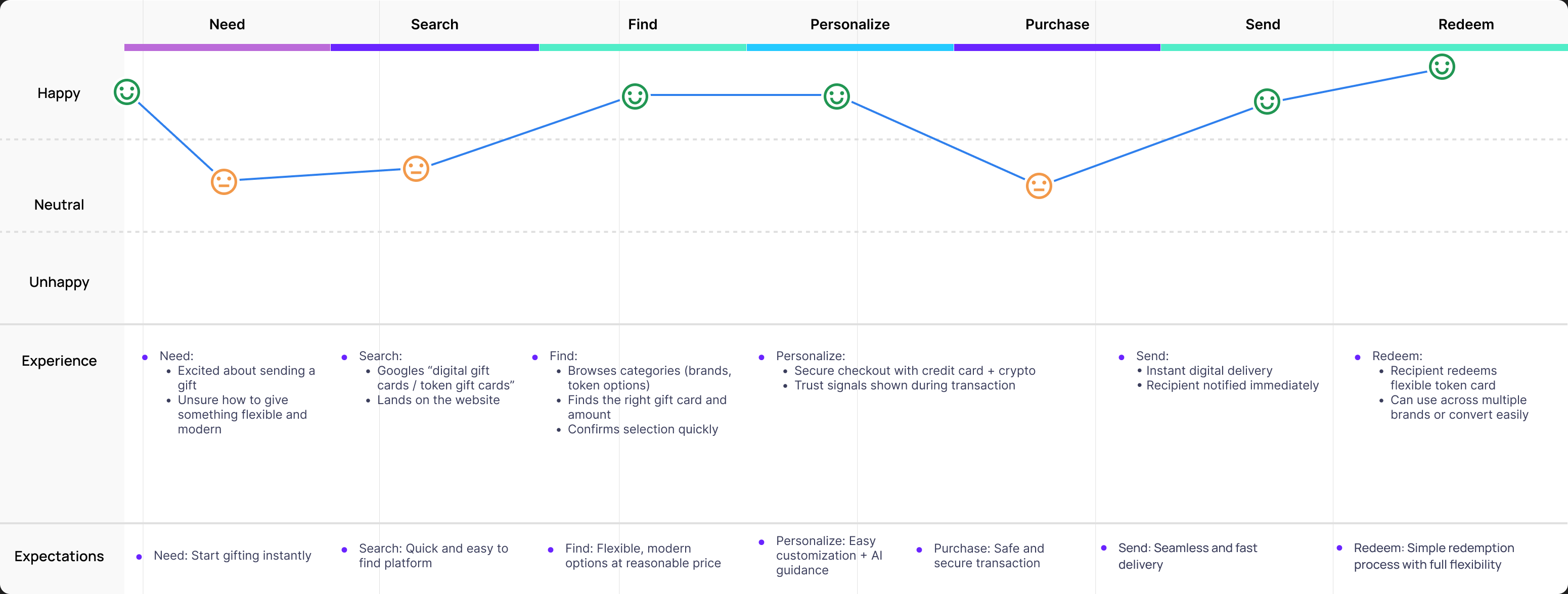
Caption: Buyer emotion charted across all seven phases, with drop-off risk peaking at Search and Purchase.
Phase 2: Define & Strategy
Research gives you a mess of findings. This phase is where I decided what the project was actually promising.
I turned the research into three prompts to design against, each aimed at a phase where the journey map showed buyers bleeding out:
How might we remove the setup work entirely?
Targets Redeem, the phase every competitor treats as the recipient’s problem.
How might we earn trust at checkout?
Targets Purchase, the second abandonment spike on the journey map.
How might we deliver the whole thing in under 60 seconds?
Targets Search through Send — the stretch where a buyer either finishes or gives up.
I also built a KPI dashboard model defining success in business terms: conversion moving from 1.8% to 4.2%, $180,000 in projected sales, and a satisfaction score of 4.8 out of 5. That connected design decisions to money, time, and trust so the work could be judged on outcomes, not looks.
Phases 3 & 4: Systems Design and Prototyping
Phase 3: Systems design & architecture
An AI gift card looks simple on the surface. Underneath, it has to talk to several providers, confirm a payment, mint a code, and deliver it in seconds.
The 3-layer system blueprint
I split the product into three layers to prove the hard parts could stay hidden. Complicated plumbing is fine, as long as the front door is simple.
The User Layer
Checkout and customization a clean cart and personalization builder, modeled on patterns shoppers already know.
The AI Layer
Help with personalizing the gift: progressive prompts that suggest a package size and draft a greeting. The giver edits or overrides all of it.
The Blockchain / API Layer
Instant delivery and code validation secure token generation running invisibly underneath.
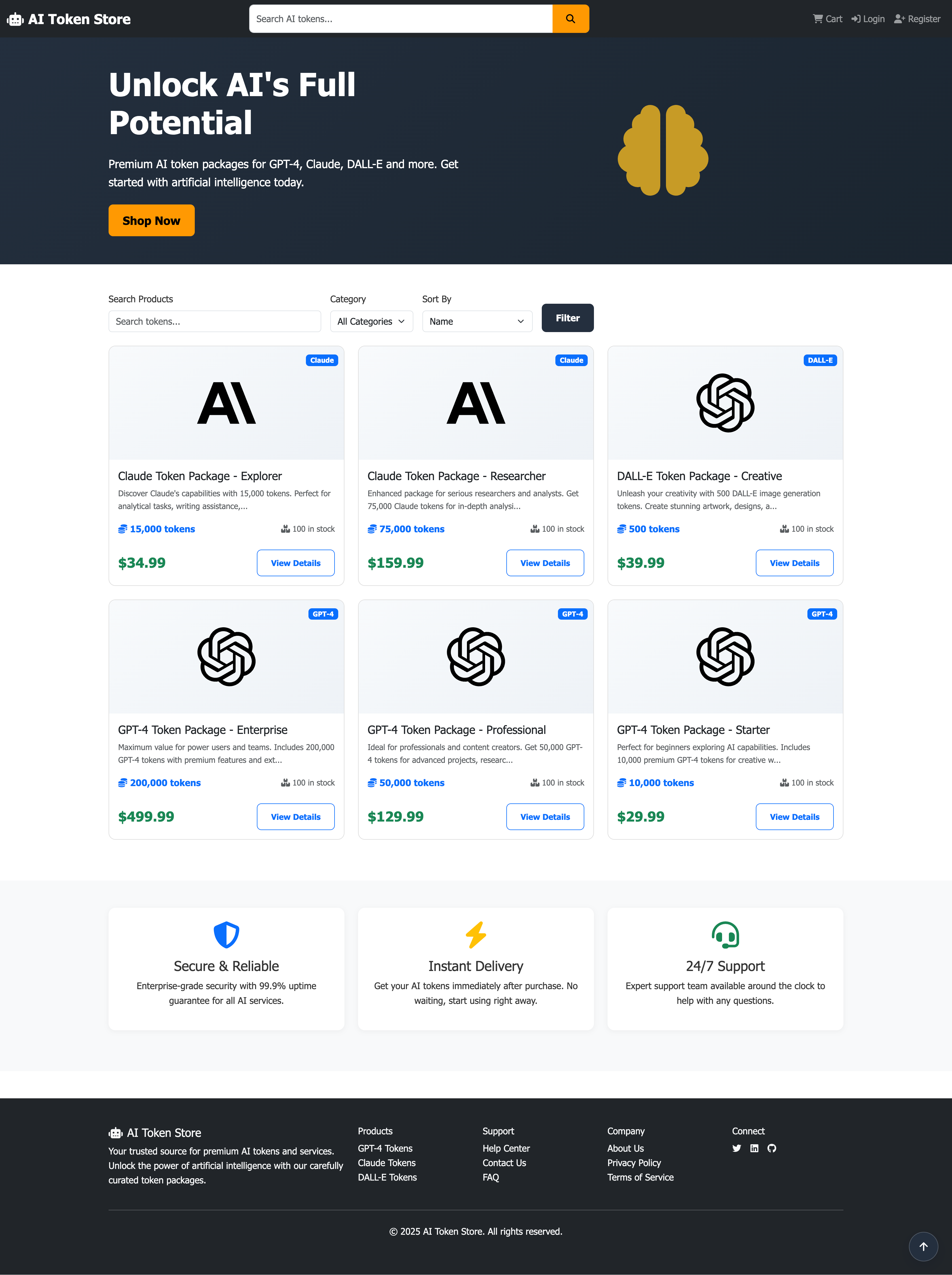
I designed product cards that state exactly what you’re buying for example, Claude AI: 15,000 tokens for $34.99. That turns an invisible thing (API credits) into something a shopper can price out at a glance.
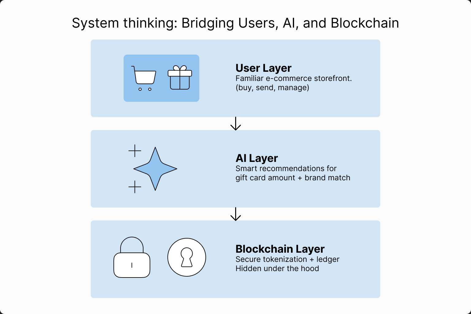
Caption: Every technical concern routes to the lower two layers so the buyer never encounters it.
Phase 4: Prototyping & proving it could work
I designed 80+ screens in Figma with a dark, modern palette premium feel, held to high-contrast readability then vibe coded a working HTML/CSS/JS version in Replit to test the real thing: connecting to an API, delivering a token instantly, and firing the notification back to the buyer. Clicking a live prototype surfaced problems static mockups never would have, roughly twice as fast.
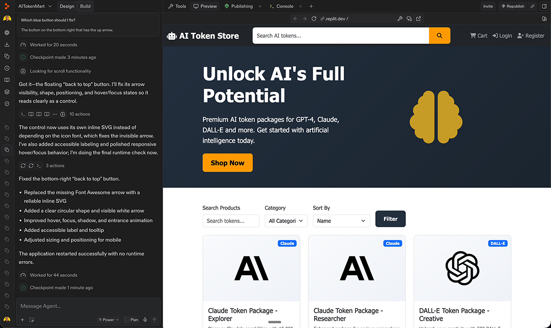
Caption: The coded prototype delivering a token package end to end, timed against the under-60-second target.
Trust indicators
Buying something you can’t hold makes people hesitate. The reassurance has to sit where the doubt shows up.
Proof next to the money
security badges, a 99.9% uptime marker, and instant-delivery icons placed right beside the buttons that cost money.
One decision per card
brand, exact token count, price, and one precise CTA: Claude AI · 15,000 tokens · $34.99. No decoding required.
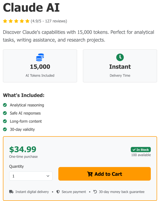
Caption: The purchase decision point after iteration — token count, price and a single call to action, with delivery, payment and refund assurances sitting directly beneath the button rather than in the footer.
Phase 5: Usability Testing & Iteration
I ran remote concept tests with five participants on their own time, watching where they paused, reread, or hunted for something to check whether the redesign actually made buying AI credits feel obvious and safe, or whether it just looked that way to me. Two rounds of changes came out of it, both landing in phases the journey map had already flagged as hot.
Iteration 1: Simpler product cards
Testers kept asking the same question: “What does a token actually get me?” The answer needed to be on the card, not a click away. I moved the token count and the dollar amount onto the front of the card, side by side.
Iteration 2: Trust next to the button
People hesitated in the last second before buying. That’s where the proof belongs not in the footer. I moved the delivery guarantee and the security badges directly beside the primary Add to Cart button.
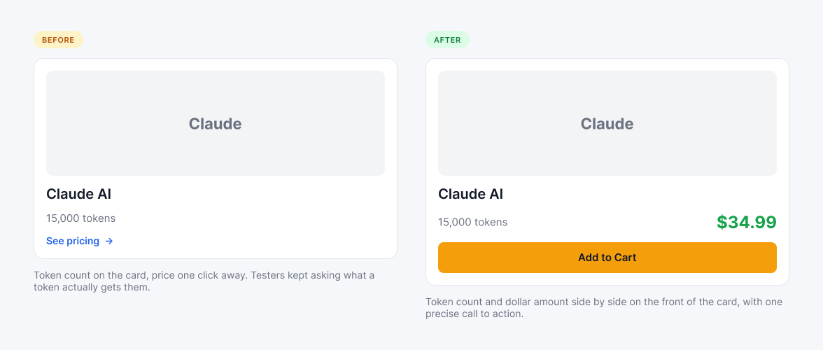
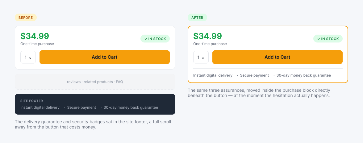
Caption: Both iterations moved information rather than adding it the same facts, relocated to the moment the buyer needs them.
Both fixes were placement problems, not content problems. The information already existed it was just sitting where the anxiety wasn’t. Trust signals only do work at the point where doubt actually occurs.
Results: Business Impact & Learnings
What the design targets (projected)
Projected · not measured
This is a concept build with no live sales data yet. Four numbers define what success would look like, chosen so the concept can be judged on business value rather than user delight alone. It has to make money, save time, and earn trust.
This is a concept project. These figures are design targets modeled against researched benchmarks and the coded prototype exists precisely so they can be tested honestly rather than asserted.
What I validated (measured)
Measured · validated
A working end-to-end prototype.
The coded Replit build proved the core promise was technically real: buy, personalize, deliver, redeem with no developer account on the recipient’s side.
Two confirmed friction points.
Testing with five participants produced the same two stumbles every time: unclear token value and last-second checkout doubt. Both got fixed and retested.
A feasible architecture.
The 3-layer blueprint showed engineering how multi-provider APIs could run behind a single, simple checkout instead of leaking complexity onto the customer.
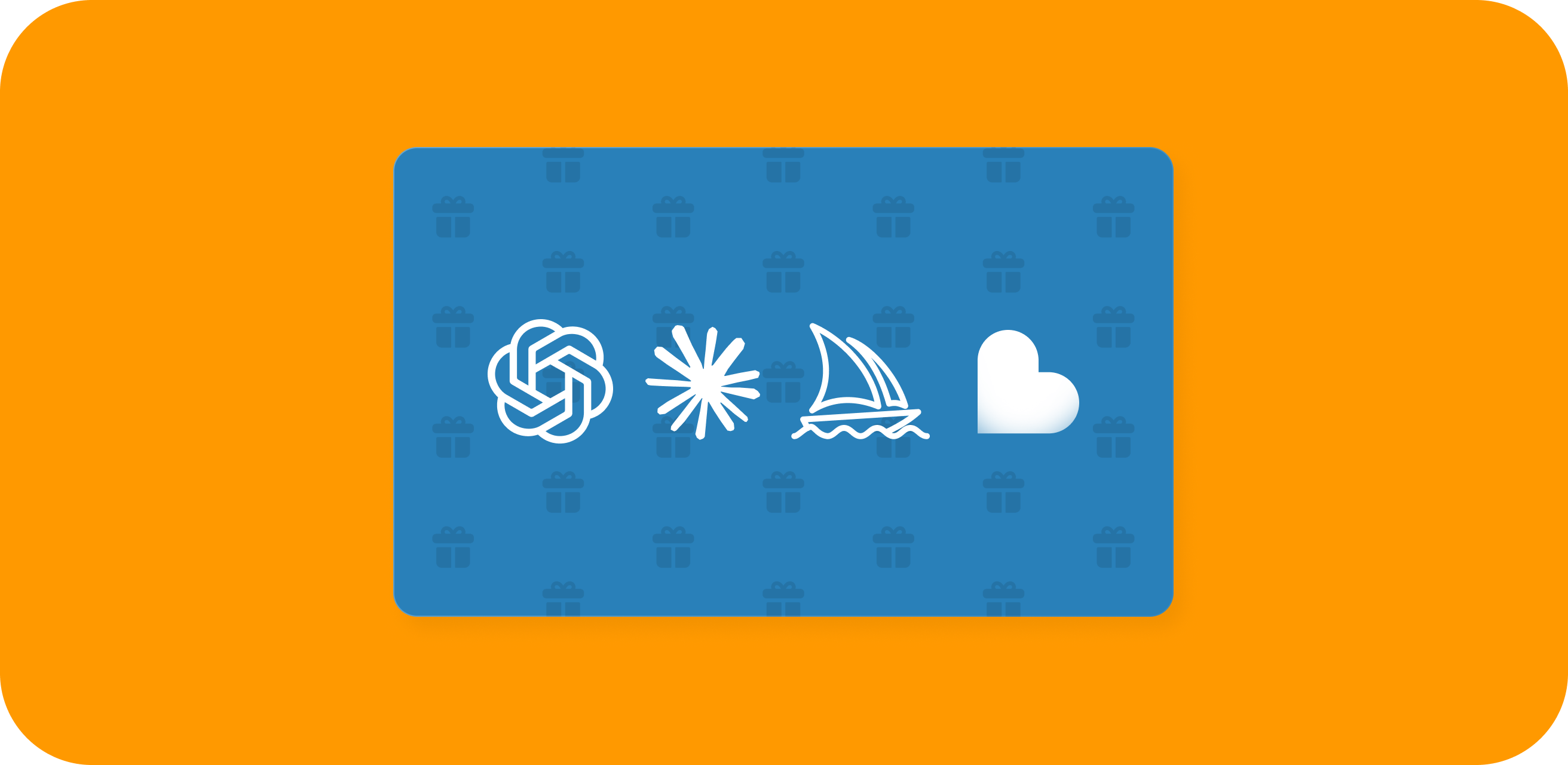
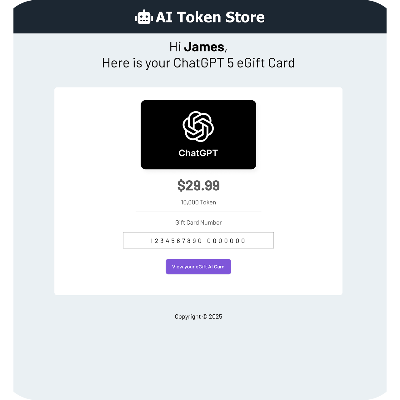
Caption: The giver’s personalized card and the recipient’s redemption email the two ends of the loop, with no setup between them.
Next steps
Work with backend engineers to connect live payment processing Stripe or crypto and finish the token-redemption webhooks. Then run a closed beta with 50 active users to measure real transaction times and hear how the instant redemption actually lands.
Future considerations
With more time, I’d build group gifting several friends or teammates chipping in on a bigger package like Claude Enterprise or a Midjourney team plan, with sharing built into the flow. High-value AI plans are exactly the kind of gift one person won’t buy alone.
Digital gifting has been treating AI access like a subscription problem. I designed it as a checkout problem and built the working prototype to prove the difference.
Lessons Learned: What “AI-First Designer” Actually Means
Systems before screens.
The hard problem here wasn’t visual it was architectural. The interface only feels effortless because the 3-layer scaffold routes every complex thing away from the human.
Understand the plumbing well enough to hide it.
Being an AI-first designer isn’t about making an attractive interface for an AI product. It’s about understanding the messy technical systems underneath well enough to conceal them.
Prototype the promise.
When the value proposition is speed, code is the only honest fidelity. Figma sold the vision; Replit stress-tested it.
What reaches the customer should feel human, predictable, and worth trusting with a credit card. The best compliment a system like this can earn is that nobody notices it: the giver clicks, the recipient creates, and all the homework in between simply never happens.